We’ve all seen them: The Facebook ad so bad, it brought tears to your eyes.
Sadly, this unfortunate occurrence is often more than once-in-a-lifetime.
There are more than 5 million businesses advertising on Facebook each month.
As you can imagine, this means there’s plenty of opportunity for the good, the bad, and the ugly of Facebook ad examples.
Instead of pitying the poor digital marketers that run such advertising atrocities, use them as examples of how to improve your own Facebook ad strategy.
We’ll show examples of what the worst Facebook ads of 2017 look like (prepare the tissues).
We’ll also tell you exactly where they went wrong and provide tips for how to advertise on Facebook the right way.
With an average conversion rate of over 9% across industries, it’s no surprise every social media marketer is trying to get a slice of the Facebook ad pie.
Here’s how to achieve conversions and boost your bottom line by learning from the worst Facebook ad examples of 2017.
Exhibit A: The Worst Ads on Facebook Have No CTA
Every Facebook ad has a goal of conversions.
Whether that’s measured in engagement (i.e. likes), app downloads, or purchases, a successful advertisement includes a clear CTA and callout within its copy.
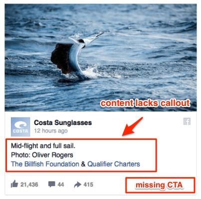
Costa Sunglasses missed the mark with their Facebook ad, which has no discernible CTA at all.
The only options in this Facebook ad example appear to be to Like the ad or follow the two links to business pages.
When you launch your strategy, be sure your copy directs users to a clear call-to-action.
Include the CTA button directly within the ad, and use your text to include a callout of the product or service that will compel people to convert.
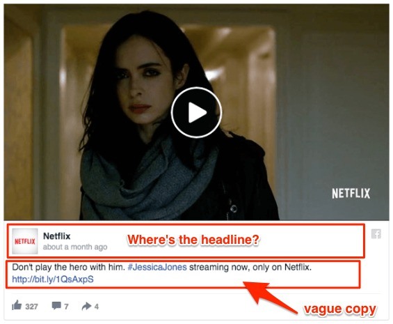
Exhibit B: Failure to Hook the Customer
There are certain psychological principles that govern the success of a Facebook ad.
A catchy headline and copy is one of the most effective ways to tap into a user’s mindset.
You can use content for relating to people, grabbing their attention, building value, and more.
 Even the big guys can fail.
Netflix shows what happens when the content misses the mark with this example of one of the worst Facebook ads.
Despite using catchy video content, the ad fails to attract the attention of users to even click through because of its vague text and lack of headline.
The fact is, 60% of people will only read a headline before sharing a social media post.
You need to compel people that are both aware of your brand and those that are not with informative yet concise content.
Try using this headline guide from BuzzSumo and A/B testing what works best for your brand’s Facebook ad strategy.
Always, though, include a headline and excite both new and current customers within the ad copy.
Exhibit C: A Facebook Ad Strategy That Fails to Build Value
Before someone will take action on a Facebook ad, they need to feel that doing so will provide some kind of benefit to them.
The value can be tangible, like a promotion offering a coupon code of 25% off.
It can also come from solving a customer problem or pain point.
However you build value, make it explicit when launching your Facebook ad strategy.
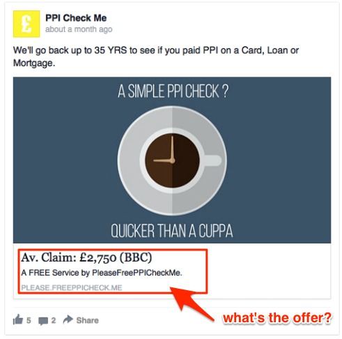
PPI Check Me gets close to providing that value with their caption and visual.
It’s clear they’re offering a PPI check, but they are in this list of the worst ads on Facebook because they fail to link the offer with the incentive.
The questions you need to answer in your Facebook ad strategy are: Why should someone be interested in your offer and what even is your offer?
Connect the dots for your in the headline, sub-headline, and caption so customers know the value.
Exhibit D: Your Facebook Ad Has a List That Goes On and On
Good Facebook ad copy should be short and sweet.
It’s true that striking the right balance of being informative without giving too much way is no easy task.
However, there are certain things you definitely should not do while trying to find that perfect harmony.
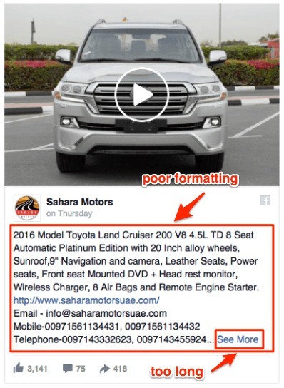
Sahara Motors is the unfortunate Facebook ad example of choice here.
A run-on sentence as the first thing the user reads is a huge no-no.
That sentence also lists out every value-add and feature the product offers, which leaves the customer with no incentive to click through and learn more.
Not only is the formatting difficult to read, but also the entire Facebook ad itself is too long.
According to Facebook, the best copy clocks in at 90 characters or less.
Requiring people to click “See More” on your Facebook ad means the copy is too long.
Again, you’re trying to achieve the right proportion of informational and compelling content.
Too much of either and you’ve just lost out on valuable click-throughs.
Exhibit E: Too Much of Everything
We’ve already seen what too much text looks like.
How about too many visuals?
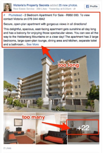
Victoria’s Property Secrets’ Facebook advertisement suffers from both too much copy and too many additional photos.
They’ve basically turned a print ad into a digital one, and were over-eager in wanting to include an excessive amount of visual aids.
Consider that the most successful brands use only 14 words or less for their Facebook ads.
Meanwhile, the worst Facebook ads can overdo their content to the point of being overwhelming.
Keep all of the content of your Facebook ads concise.
This will encourage people not only to read the whole thing, but also to click through and learn more or shop.
They’ll feel an urge to know more details because your Facebook ad left out enough to intrigue them.
Exhibit F: A Facebook Ad Example of Visuals Gone Awry
The last piece of the puzzle that we haven’t yet discussed in full is the visual component.
Any successful Facebook ad strategy incorporates a graphic (i.e. video, static image, carousel) that grabs the user’s attention.
Besides being eye-catching, the visual should also relate to the brand or promotion.
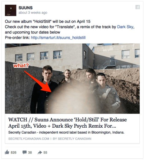
The ad above from the band Suuns demonstrates what the worst Facebook ads can look like from a visual standpoint.
It’s both too distracting and poor quality.
The smudge in the center of the screen – though it may be intentional – takes attention away from the goal of the advertisement.
Include a visual aid that supports the objective of your Facebook ad strategy.
Additionally, make sure it is a high-quality image devoid of too many additional details, like this mysterious smudge.
How the Worst Facebook Ads Make Yours Better
Creating good ads is also about knowing what the worst ads on Facebook look like.
Start by avoiding the mistakes by the brands above and taking into account our suggestions for improving a Facebook ad strategy.
Do it right, and you might just find yourself on the list of the best Facebook ad examples of the year.